
Japan Apparel Gallery
“Where Textile Becomes Choir”
A comprehensive curatorial study exploring Japanese Professional Baseball (NPB) jerseys not merely as athletic uniforms, but as an intricate intersection of fine craft, bilingual typography, corporate heritage, and synchronized fan culture.
Curatorial Overview
In the curation of the Baseball Art Museum, the NPB uniform represents a masterclass in applied design. Unlike North American baseball gear, which historically prioritized individual player branding, Japanese uniforms developed as a visual extension of corporate identity, artistic typography, and collective fan choreography.
Below is an analytical breakdown designed to give visitors a deep, scholarly, and visually rich exploration of NPB jersey design.
Table 1 contrasts major design and cultural elements between North American and Japanese professional baseball apparel, illustrating how distinct regional art directions shaped team presentation.
Table 1. Comparative Visual Analysis of Baseball Uniform Design
| Design Element | Major League Baseball (MLB) Approach | Nippon Professional Baseball (NPB) Approach |
| Primary Typography | Traditional English block lettering, script chest names (e.g., Red Sox, Yankees). | Bilingual integration: Blending English Roman scripts with complex Japanese Kanji (漢字) characters. |
| Corporate Integration | Minimal or absent on-field sponsor logos (historically pure team identity). | High integration: Seamless incorporation of corporate parent-company branding and multi-sponsor patches. |
| Fan Aesthetic Function | Worn to display individual loyalty to a star player or historical franchise. | Worn as a uniform component of an organized cheering block (oendan mosaic). |
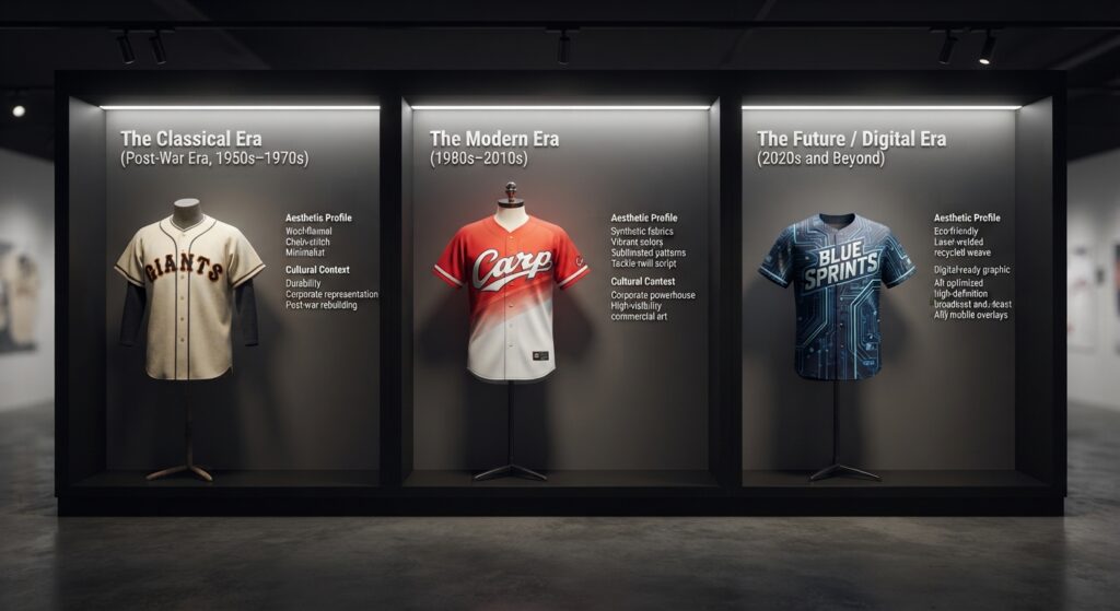
Figure 1. The Chronological Evolution of NPB Jersey Art
Historical Evolution of NPB Jersey Art (1936–Present)
The evolution of Japanese baseball jerseys reflects the broader cultural shifts of modern Japanese history, moving from military-inspired austerity to global pop-culture vibrancy.
- The Classical Era (Post-War Era, 1950s–1970s):
- Aesthetic Profile: Heavy wool-flannel blends, heavy chain-stitch embroidery, and minimalist color palettes (typically monochrome or dual-tone).
- Cultural Context: Designed for durability and corporate representation, mirroring the post-war industrial rebuilding of Japan.
- The Modern Era (1980s–2010s):
- Aesthetic Profile: Introduction of double-knit synthetic fabrics, vibrant chromatic identities, gradient sublimated patterns, and complex multi-layered tackle-twill chest script.
- Cultural Context: The rise of corporate powerhouse franchises (e.g., Yomiuri Giants, Hanshin Tigers) pushing sports apparel into the realm of high-visibility commercial art.
- The Future / Digital Era (2020s and Beyond):
- Aesthetic Profile: Eco-friendly recycled polyester weaves, laser-welded ventilation, and digital-ready graphic layouts optimized for high-definition broadcast and AR mobile overlays.
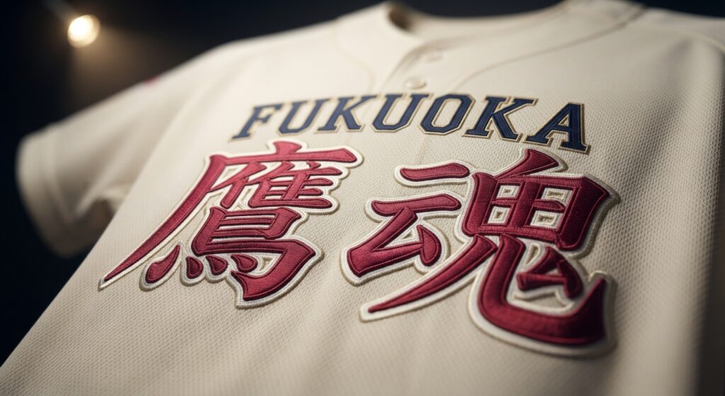
Figure 2. The Bilingual Typography & Kanji Synthesis
The Typography & Kanji Synthesis
- The Art Form: The juxtaposition of Western athletic block letters with traditional Japanese calligraphy.
- Design Breakdown: NPB designers face the unique challenge of balancing the sweeping horizontal flow of English letterforms with the vertical or square grid balance of Kanji characters. The resulting chest script often functions as a piece of avant-garde graphic design, utilizing custom-kerning and dimensional drop shadows to unify two completely different writing systems.
The Oendan (応援団) Visual Mosaic
- The Art Form: Collective kinetic art.
- Design Breakdown: In NPB culture, the outfield cheering sections operate as an organized choir. The jerseys are engineered not just for the individual athlete on the diamond, but to create a massive, synchronized block of color when thousands of fans jump, wave flags, and chant in unison. The uniform acts as pixels in a human-scale stadium mural.
What Makes NPB Jerseys Unique? The Innovation of Collective Visual Integration
The core innovation that sets Japanese Professional Baseball (NPB) jerseys apart from any other country lies in corporate-aesthetic structural integration and collective fan choreography:
- Corporate-Aesthetic Harmony: Unlike Major League Baseball (MLB)—which historically keeps commercial advertising off team uniforms to preserve a traditional, independent look—NPB jerseys are built directly around corporate parent ownership. Rather than treating sponsor patches or corporate names as disruptive visual clutter, Japanese jersey design weaves them seamlessly into the garment’s core visual architecture through advanced multi-layered tackle-twill stitching and precise color-blocking.
- The Oendan (Cheering Section) Visual Mosaic: In international sports, jerseys are primarily worn to showcase individual consumer fandom or loyalty to a single star player. In NPB, the jersey is engineered as a functional module for collective synchronization. Thousands of fans in the outfield wear identical jerseys to act as literal “pixels” in a massive, living stadium mural, creating a kinetic work of art when the entire section moves, jumps, and chants in unison.
References
- Kelly, W. W. (2018). The spirits of Japanese baseball: Bat, ball, and field in contemporary Japan. University of California Press.
- Whiting, R. (1989). You gotta havewa. Vintage Books.